Brand Design, Naming, Packaging Design, Web Design, Copywriting
DIO BEAUTY
Background
DIO Beauty is a new start-up venture for a gender-neutral make-up range that delivers products to their customer’s door via a subscription delivery service.
Brief
Create a new brand identity that empowers everyone to dismantle the beauty status-quo and experiment towards something new.
Client
Self-assigned
Brand Board
Logos
Variable logos inspired by cut and paste, DIY style punk zines.
Color Palette
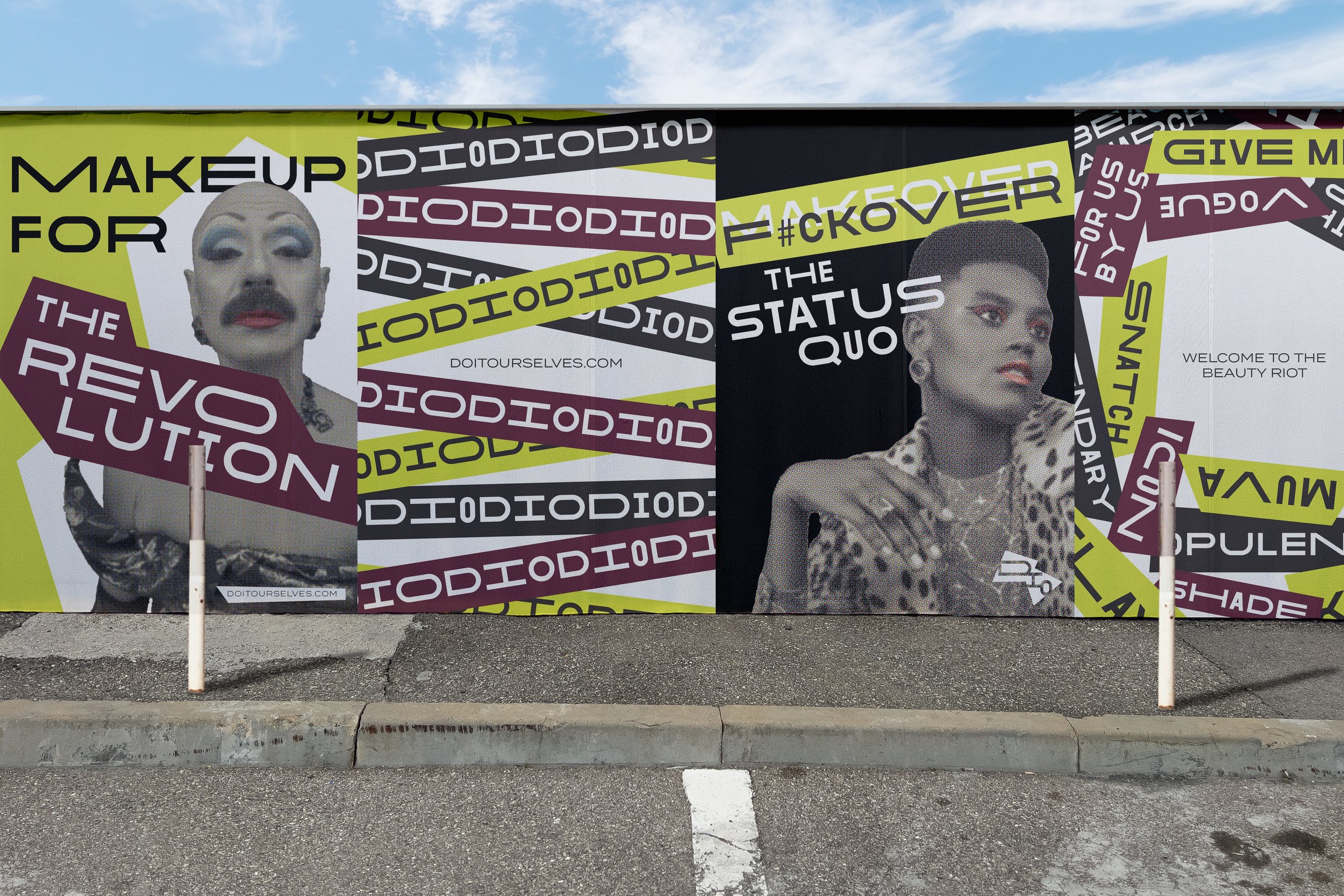
High contrast color palette that feels fun, unexpected, and fearless.
Graphic Elements
Sharp lines and overlapping elements to create the layered, imperfect effect like band stickers on the bathroom wall of a music venue.
Photo Treatment
Black and white bitmap photos to add some grit and texture, as well as callback to the brand’s grassroots, punk inspiration. Isolated colors for makeup to emphasize the artistry and impact of makeup as a tool of self-expression.
Typography
Highly variable typeface for headlines inspired by collage lettering of DIY zines.


